CSS 绘制扇形

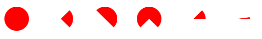
CSS绘制扇形的基础可以从一个圆形出发,一个正方形用border-radius: 50%;很简单就能构造出来。

1
2
3
4
5
6
7
8
9
<style>
.circle{
width: 50px;
height: 50px;
background: red;
border-radius: 50%;
}
</style>
<div class="circle"></div>

结合4边border就可以很简单的构建出90deg,180deg,270deg的扇形了。

1
2
3
4
5
6
7
8
9
10
11
12
13
14
15
16
17
18
19
20
21
22
23
24
25
26
<style>
[class|="sector"]{
width: 0;
height: 0;
border: 25px solid red;
border-radius: 50%;
}

.sector-90{
border-top-color: transparent;
border-bottom-color: transparent;
border-left-color: transparent;
}

.sector-180{
border-bottom-color: transparent;
border-left-color: transparent;
}

.sector-270{
border-bottom-color: transparent;
}
</style>
<div class="sector-90"></div>
<div class="sector-180"></div>
<div class="sector-270"></div>

任意角度的扇形

CSS现在有了clip-path这个属性,可以控制裁减,所以任意角度的扇形都可以弄出来啦~~~

1
2
3
4
5
6
7
8
9
10
<style>
.clip-sector-45{
height: 50px;
width: 50px;
background: red;
clip-path: path('M 25 25 L 50 25 L 50 0 Z');
border-radius: 50%;
}
</style>
<div class="clip-sector-45"></div>
1
2
3
4
5
6
7
8
9
10
11
12
13
14
15
16
17
18
19
20
21
<div id="clip-sector-jsdeg"></div>
<style>
#clip-sector-jsdeg{
height: 50px;
width: 50px;
background: red;
border-radius: 50%;
}
</style>
<script>
let startTime = Date.now()
function render(){
let deg = 360 * (Date.now() - startTime % (3 * 1000)) / (3 * 1000)
let x = 25 + 25 * Math.cos(deg / 180 * Math.PI)
let y = 25 - 25 * Math.sin(deg / 180 * Math.PI)
let dom = document.getElementById("clip-sector-jsdeg")
dom.style.clipPath = `path('M 25 25 L 50 25 A 25 25 0 1 0 ${x} ${y} Z')`
requestAnimationFrame(render)
}
requestAnimationFrame(render)
</script>

最终的结果

END

2020-09-29 完成

2020-09-29 立项