最近使用boder-image来实现了一个看起来可能也许好看的边框,中间对boder-image的了解很少,查到了很久才明白了一些,这篇文章将讲述boder-image的使用以及我遇到的一些问题。
最简单的应用
1 |
|
要使用图片做边框背景我们至少需要border-image-source 以及 border-image-slice 、 border-style。
这里 border-style 有些浏览器不需要有些需要,视浏览器而定。
border-image-source
这个属性代表的图片,这里可以使用 url 来引入图片,当然也可以使用CSS的渐变属性绘制的图片,比如 linear-gradient
1 |
|
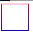
这样我们就实现了一个简单的渐变色边框
border-image-slice
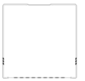
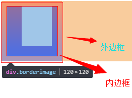
这个属性会通过规范将 border-image-source 的图片明确的分割为9个区域:四个角,四边以及中心区域。这个将会通过指定的四个内向距离来实现。

(ps:哈哈,懒得弄图了,直接用MDN的了=、=)
上图的4条红色的虚线便是 border-image-slice 的值定义出来的。
border-image-slice:top right bottom left
border-image-slice的值定义的是这些切线距离边的距离,不需要加上 px。
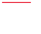
比如将上方示例代码弄成
1 |
|
这样就只有上边有图片了,因为其他区域为0,切出来的图片区域为空,放上去当然也是没有啦。
这里基本对这个属性的作用就明白了,但还有一些需要注意的。
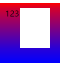
fill
border-image-slice 的值可以插入一个fill值,这样本来无用的中心区域就变成了背景图片了
1 |
|
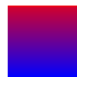
这个 fill 在MDN上说任意位置都可以但是谷歌浏览器上只能放在两边,个人认为还是放在两边好(好看~~)。
如何展示
这个属性只负责截取图片区域,这些图片的区域如何使用将有其他属 :border-image-width、border-image-outset border-image-repeat。与它截取的大小等等都没有关系!。
其他属性
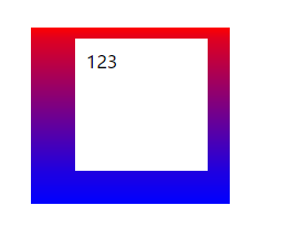
border-image-width
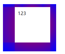
这个属性代表的图片展示的宽度,默认当然就是 border-width,但是可以独立出来,比如
1 |
|
可以看到其实边框的宽度依然为10px,但是因为我们定义的 border-image-width 更大所以图片延伸到了内部,在里面加点字就更加明了了。
这个只是图片延伸了过去,不会影响内部的排版。
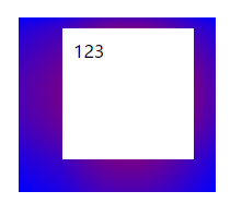
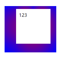
border-image-outset
上面的情况,图片宽度超出时,图片会向内部扩展。当然我们可能也需要向外,但是这个不是简单的设置一个 向外 就搞定了。
border-image-outset 属性便是可以实现这个效果的属性。这个属性将会让边框图片向外偏移设置的值。
1 |
|
border-image-repeat
这个属性负责当图片尺寸需要展示的区域尺寸不同时,如何展示。
主要有三个值 stretch 、 repeat 、 round。
stretch 这个值代表拉伸图片
repeat 这个值代表平铺图片,将不会压缩图片
round 这个值是stretch和repeat的折中,会优先拉伸,当可以放两个时在放两个,依次增加。
后记
boder-image 相关的属性一共就这五个,理解起来还是很快的。虽然用的少,但是说不定那天就要提枪上阵了呢。

参考资料
END
2017-06-06 完成
2017-06-01 立项